Say Hello to Schweitzer's New Look
From Schweitzer’s summit, while taking in the panoramic view you find your gaze flowing down the ridgelines and landing, inevitably, on Lake Pend Oreille. It's almost metaphysical, this connection between mountain and lake, earth and water. This ebb and flow.
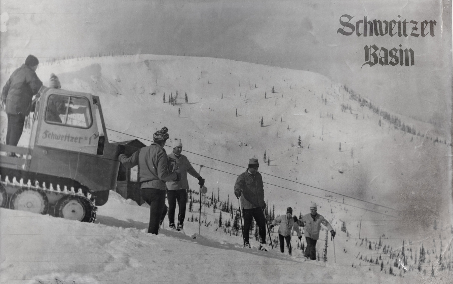
That’s what’s amazing about Schweitzer. Things seem to flow naturally from one landscape and idea to another. What started in 1963 as a simple aspiration - wanting to be able to ski close to home - has progressed from one milestone to the next, creating an incredible mountain community along the way. This flow is part of what makes Schweitzer, Schweitzer.
This isn’t just a place to ski.
It’s a vibe. A culture. Our home. Your home.

Why change?
When we examined our logo, which is intended to visually communicate Schweitzer's unique identity, we realized it wasn't adequately reflecting who we are today, nor symbolizing the future we aspire to create.
So, we decided to update it.
But this isn’t change for the sake of change. As Schweitzer evolves from a primarily winter destination to a winter and summer destination, we want our logo to reflect that shift, while doing so in a simpler, more distinctive manner.
The logo.
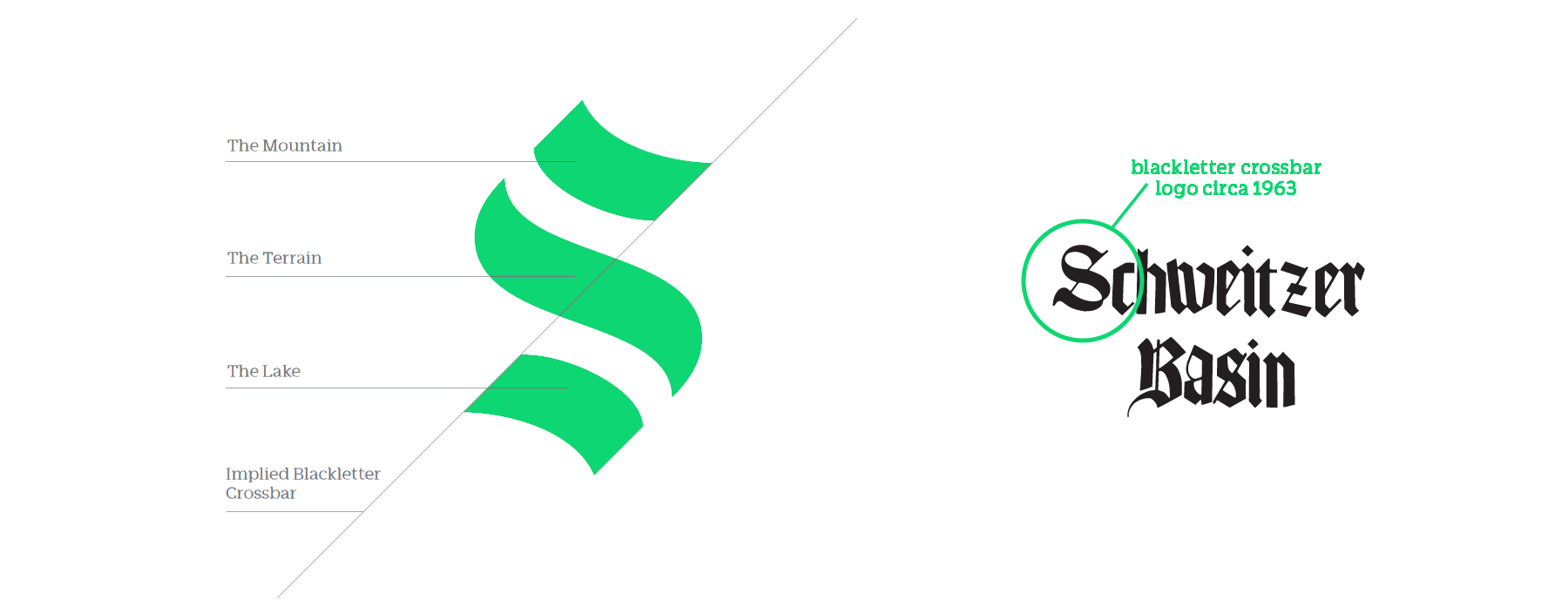
Borrowing from our history and celebrating the local landscape, our new logo is both a bold reflection of our past and a modern symbol for our future. We’ve created an “S” that consists of three balanced and symmetrical strokes. These strokes, aligned on a 45° angle, recall the blackletter crossbar of the original 1963 logo and reflect the physical influences on the resort: the peak of Schweitzer’s summit, the flowing terrain, and the resort’s natural complement below, Lake Pend Oreille. The logo is the most recognizable element of our brand and is created to imply history and the back-and-forth motion of descending a mountain.

The wordmark.
The new wordmark compliments the logo's clean, bold style while the rounded shapes of the letterforms communicate Schweitzer’s friendly, open vibe. With a nod to subtle but important design cues, it's custom-made to match the 45 degree angles of the new logo. We also think this wordmark is more readable, particularly given the variety of mediums within which it will appear.

The colors.
Schweitzer is a place populated by unique characters enjoying one of the most amazing natural environments. We want a color palette that reflects this dynamic interaction.
Although our new primary brand color - green - is based on our enduring connection to the natural environment, our secondary brand colors of yellow and orange are inspired by the dynamic hues used in a wide range of outdoor wear, from retro-ski outfits to more modern mountain bike clothing and accessories.
These colors match the spirit of our Schweitzer family - alive, vibrant, and radiant.

The name.
Oh, and one other thing. People who know us call us by our first name, "Schweitzer." Nobody says, “hey wanna hit Schweitzer Mountain tomorrow?” Or, “Schweitzer Mountain Resort got dumped on with seven inches of new snow!” We don't want to talk that way either. Going forward, we're keeping it simple and shifting from "Schweitzer Mountain Resort" to the much friendlier, "Schweitzer."

The future.
The new logo, wordmark and colors are one aspect of Schweitzer’s new brand identity. Over the course of this year and into 2022, you’ll begin to see all the other visuals that make up the Schweitzer brand aligning around this new direction: the website, our village wayfinding system, in advertising, throughout our social media channels, on your season passes and a variety of other communication mediums.
With this redesign, we set out to retain all the elements that endeared our earliest customers to Schweitzer, while creating space for the brand to evolve. But rest assured, it’s still us. We hope you like our new look, designed to more accurately capture and reflect our home. You'll recognize us in an instant.
We are Schweitzer.


